Working Hours
Mon - Fri 8AM to 5PM
Free Mobile Friendly Website Responsive Checker & Tester
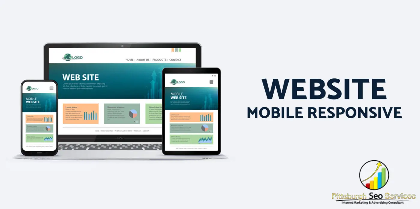
Pittsburgh SEO Services offers a free Mobile Responsive Test to make sure your site is ready for both search engines and users. This is the future of web design and development. Responsive Web Design makes your site look great on any device, no matter how big or small.
How does responsive web design work?
In terms of responsiveness, a responsive website will change its layout, font size, and other things depending on what device or screen size you’re using to access it.
A responsive website is one that can be viewed across all devices, from desktop computers to smartphones. Responsive web design is all about the experience of the user. With responsive web design, users can be sure they’ll have an optimal browsing experience no matter where they are or what device they’re using by creating a single site that will appear appropriately on any device. Having a responsive website means that your content can reach more people as there are many different types of devices and screen sizes out there.
What is the best way to test the responsiveness of my website?
You can instantly see whether your website is mobile responsive by entering its URL and clicking “Submit”. We’ll show you how it looks on mobile devices and tablets, as well as desktop computers.
Having tested your site and made sure it’s responsive, you can rest assured that people will be able to view it properly on any device.
What to Expect from Responsive Design?
- See as a User:
An outline, or wireframe, of the website, is created by designers and developers together. This phase involves user experience (UX), interaction with site elements, and a basic design.
- Layouts that are complementary:
Designers create designs for various screen sizes while maintaining brand integrity, layout, and user experience consistency. As screen sizes decrease, elements stack, scale, or collapse into expandable sections.
- Expect Some Shifts:
In order to ensure a quality user experience, everything from image and font sizes to navigation structure may need to be adjusted between screen sizes.
- Magical Programming:
Media queries are used to validate the user’s screen size and display the appropriate layout based on the design parameters.
- Evolution:
Today’s web development isn’t about one-size-fits-all solutions. It’s about utilizing new technologies to create meaningful and effective user experiences.
- Responsive Check-ups:
Technology is constantly changing, so it’s important to check up on your responsive design at least quarterly. This will allow you to identify if there are any responsive issues with your website and make any necessary changes.
What is the importance of responsive web design?
According to Google, websites that use it will rank higher in search results than those that don’t. Besides helping with SEO, responsive web design can also improve the user experience by making content easier to read. This is because responsive web design makes your website look good on any device, making it a better user experience.
Visit the site in a mobile-friendly browser. If you’ve gotten into the habit of clicking “view desktop version” when you visit a website on your phone, you might be surprised to learn there’s an easier way to do this!
Creating a website that is optimized for mobile devices can greatly enhance how your audience interacts with your brand, especially in comparison to one that isn’t. Responsive sites load more promptly and can quickly adjust to different display sizes, making it simpler for users to navigate. Conversely, non-responsive sites will be slow to open and difficult to utilize on mobile devices, leading visitors to have an unsatisfactory experience with your company.
With a responsive design, your website isn’t just accessible to everyone who visits it, but also easy to navigate.